The Design Process


Our team created a system that allowed us to work both in person, and remotely. We were all attentive to the group chat, answering and providing aid when teammates were in need. We focused on organization, and had a running to do list that was color coded to indicate priority and we constantly communicated on the projects each of us were working on and what was expected of each team member. We also utilized Unity Collaborate to synchronize our projects, we decided upon this route because it allowed us to edit at the same time.
This was not an easy game to create, and the four of us put in many hours learning and creating to fully realize our initial prototype. Being able to work with a group made this project more enjoyable and feasible than the previous assignments because we had an ingrained support system to speed us along the path towards a fully shipped game.
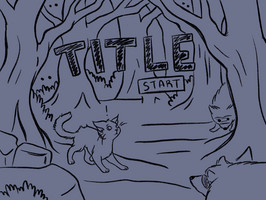
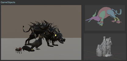
Brainstorming and Initial Design Concepts
To Do List and Team Organization
- Playtest 1 feedback
- Is that a rat? Enemy looks like food needs clarity- say eat the mouse not eat the rat
- Need more creatures to interact with
- There need to be game boundaries
- The field of play is very big, so there needs to be way to navigate and find the end goal
- Maybe include landmarks
- Enemies are too easy to avoid
- Have food run away it’s too easy to find
- Have food lead you towards objective
- Have smoke lead you towards objective
- Mesh collider instead of box collider for enemies
- Clear that things other than mice are food source
- Start on ground directly in front of first mouse
- Instead of time left indicate hunger
- Sound effects for eating
- Playtest 2 feedback
- Have player start facing other direction, to make it easier
- It’s so hard!
- How do I work the controls?
- I love the little creepy monsters
- It’s really nice that there is some wiggle room when the monsters touch you, it makes it more suspenseful to have close calls
- The forest/woods area can get confusing because there are no enemies/prey and can cause disorientation
- Some map marker would be nice because the entire map looks the same, i.e. a river, landmarks
- Enemies could be faster/more threatening
Files
Get Cat-astrophe
Cat-astrophe
| Status | Released |
| Author | myleshouse |
More posts
- PostmortemOct 20, 2021
- GamePlayOct 20, 2021
Leave a comment
Log in with itch.io to leave a comment.